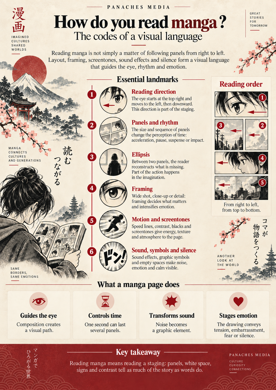
Reading manga means learning to look differently
Opening a manga for the first time can cause a moment of hesitation. The book seems to begin “at the end”, the panels follow an unfamiliar reading order, and certain graphic signs can appear almost mysterious: lines suddenly filling the background, an enormous drop beside a face, Japanese characters integrated into the artwork, abrupt changes in proportions or an almost empty page after a very dense scene.
A few chapters later, most readers no longer even think about it.
Their eyes have adapted.
That is probably one of manga’s most interesting strengths: much of its language works without requiring the reader to consciously translate it. Panels indicate where to look, their size changes our perception of time, lines suggest a speed that obviously does not exist on paper, and a few symbols can sometimes completely transform a character’s expression.
The British Museum describes manga as a particularly immersive form of storytelling in which images play a central role. Sounds, movement and emotions are not limited to written text: they are integrated directly into the graphic composition. (britishmuseum.org)
A manga page does not simply show a story. It organizes the way the reader will see it, move through it and feel it.
Understanding this language therefore changes the way we read, but it also helps explain why two artists can depict the same action and create completely different sensations.
From right to left: more than a reading habit
The first code readers encounter is also the most obvious: in their traditional Japanese editions, manga are read from right to left.
You begin from what would usually be considered the back cover of a Western book, then turn the pages toward the left. Within a page, the eye generally follows a path beginning in the upper-right area, moving toward the left and then downward.
International editions did not always preserve this arrangement. Some manga published in the West were once “flipped” to restore left-to-right reading. This made the object more familiar, but it could also reverse drawings, alter compositions or change the direction of an action.
Publishers such as VIZ now point out that preserving the Japanese reading direction helps maintain the flow originally designed by the mangaka between panels and pages. (viz.com)
That idea of flow is important.
Imagine a character running toward the next panel. The direction of their body, the position of their gaze and the empty space in front of them can naturally push the reader’s eyes toward the rest of the page. Reversing the image can sometimes alter the invisible logic guiding the reader.
Reading direction is therefore not merely a cultural convention.
It is part of the staging.
The page as a path
A well-designed page should allow the eye to move through it without forcing the reader to constantly think about panel order.
The spaces between panels, their alignment, their size or certain diagonal lines can make this movement easier. A character positioned on the right and looking left can also subtly direct attention toward the next element.
This organization becomes particularly interesting in complex scenes.
A fight can multiply viewpoints and changes of direction without becoming confusing if the composition guides the eye properly. Conversely, a deliberately chaotic page can disorient the reader in order to reflect a character’s confusion.
Panel layout does not simply separate images.
It builds a path.
A panel does not only show action: it controls time
On a printed page, every image exists simultaneously.
Yet while reading, we experience them as if they were unfolding one after another.
That illusion depends largely on the panel.
A small panel can contain an extremely brief reaction. A large panoramic panel can slow the reading experience and invite the eye to explore a setting. A full-page image can give an event spectacular importance, while a succession of small panels can break an action into fractions of a second.
The duration of a scene is therefore not directly linked to the real number of seconds it represents.
It depends on the amount of space the artist chooses to give it.
One second can become an entire page
Take a very simple action: a character hears a noise behind them and turns around.
It could be told in a single panel.
But the mangaka can also show the sound, then the character’s eye, their hand tightening, a detail of the environment, their face beginning to turn and finally what they discover.
The event may have lasted only one second.
For the reader, however, that second has stretched.
Suspense appears precisely within the interval created by the panel sequence.
Conversely, several years can disappear between two panels. A changed location, an older character or a few words may be enough for the reader to mentally reconstruct everything that happened in between.
This ability to show certain stages while removing others is one of the fundamental mechanisms of visual storytelling.
What happens between two panels belongs to the reader
Between two panels there is usually a strip of white space.
Graphically, almost nothing.
Narratively, it can contain a great deal.
If one panel shows a character raising a sword and the next shows their opponent lying on the ground, the strike itself may never have been drawn. Yet the reader naturally reconstructs the action.
This is an ellipsis.
Comics constantly rely on this participation: we connect images, imagine missing movement and transform a sequence of still drawings into continuous events.
Research on visual narratives shows that readers can understand an event even when a central part of the action has deliberately been omitted, as long as the remaining information allows them to infer what is missing. (cambridge.org)
Manga makes extensive use of this ability.
It can show an attack without showing the impact, suggest movement through a simple change of setting or move from a face to an object to communicate a thought without writing it down.
Part of the story is therefore never drawn: it appears in the reader’s mind between the panels.
This economy can make a scene faster, but it can also make it more powerful.
What we imagine is sometimes more important than what we see.
Framing means deciding what matters
Cinema has wide shots, close-ups and camera changes.
Manga has comparable freedom, with one major difference: its “camera” does not actually exist.
The artist can place it absolutely anywhere.
A wide shot can establish an environment or the position of the characters. A closer shot can focus attention on an interaction. A close-up of an eye, a hand or a mouth can turn a detail into an event.
These changes in framing directly influence emotion.
A character shown from very far away within a huge environment may appear isolated. The same character, suddenly framed tightly around the eyes, can become threatening. A hand hesitating over a door handle can be given as much importance as a face if that hesitation is the true focus of the scene.
Comic-creation tools also recommend reserving greater detail for large panels, close-ups or images on which the artist wants the reader to linger. (clipstudio.net)
Drawing is therefore not necessarily about showing as much information as possible.
It is about showing the right information at the right moment.
Making a still image move
A manga obviously does not move.
And yet some pages create an almost physical impression of speed.
Motion lines play a major role in this illusion. They can follow an object, cross a background or converge toward a character to indicate direction, acceleration or impact.
In an extremely fast scene, the environment may almost disappear entirely in favor of these lines.
The reader no longer sees the setting precisely.
They feel the speed.
Software dedicated to manga production now includes tools specifically designed to create action lines, speed lines and converging effects, showing how deeply these conventions have become embedded in the medium’s visual language. (clipstudio.net)
Objective movement, perceived movement
Not every line represents literal motion.
A completely still character can be surrounded by dramatic lines to express a revelation, fear or sudden pressure. The background then stops representing a physical location and becomes an emotional surface.
This is a very important feature.
Within the same page, the environment may be rendered realistically in one panel and disappear entirely in the next because the character’s emotion has become more important than the place itself.
Manga can therefore move very quickly from physical space to mental space.
Black, white and screentones: drawing without color
Manga is strongly associated with black and white.
This choice is not absolute: some opening pages are printed in color, special editions may be fully colorized, and digital publishing now allows many different approaches. But traditional black-and-white publication remains deeply connected to the constraints and rhythm of Japanese serialization. Clip Studio notes in particular that this limited use of color supports a production pace compatible with weekly or biweekly publication. (clipstudio.net)
The absence of color does not mean the absence of nuance.
Between the black of the ink and the white of the page appear screentones.
These surfaces made of dots, lines or patterns can create different shades of grey, shadows, textures or moods without using color. In black-and-white manga, they can perform the role that gradients or areas of color would otherwise occupy. (clipstudio.net)
A light screentone can soften a scene.
A nearly black area can make it heavier.
Patterns can separate a character from reality to emphasize a romantic, disturbing or comedic moment.
Black and white then becomes less a limitation than a vocabulary.
Contrast also guides the eye
A dark mass immediately attracts attention on a light page. Conversely, a pale face surrounded by darkness can become the visual center of the entire composition.
The artist can therefore establish a hierarchy of information without adding a single word.
Contrast tells us where to look, where to linger and sometimes even what to feel.
When emotions become symbols
The human face already has many ways of expressing joy, anger or fear.
Manga often goes much further.
An enormous sweat drop can signal embarrassment. Stylized veins can amplify anger. Vertical lines darkening the face can suggest despair or discomfort. A character can suddenly lose realistic proportions and become tiny or caricatured to turn a reaction into a gag.
These conventions are sometimes grouped under the term manpu, which refers to different graphic symbols used to express movement, physical states or emotions.
The British Museum specifically mentions Giga Town by Kōno Fumiyo, a work that uses characters inspired by the Chōjū-giga to explain this genuine grammar of manga symbols. (britishmuseum.org)
These symbols work because readers gradually learn their meaning.
They no longer interpret a huge drop next to a character’s head literally. They immediately understand the emotional state it represents.
Manga can therefore make visible something that normally cannot be seen: embarrassment, tension, confusion, dizziness or a sudden thought.
Words themselves become images
Footsteps. An explosion. A door slamming.
In a novel, these sounds have to be described with words.
In a film, they can actually be heard.
Manga has to find another solution: draw them.
Sound effects therefore occupy a particularly important place on the Japanese page. They are not necessarily confined to a speech bubble or placed discreetly beside the action. Their size, orientation, shape and integration into the artwork can become a full part of the composition.
A violent sound may fill a large portion of the panel.
A faint noise may almost disappear into the background.
Some Japanese expressions even go beyond real sounds. Gitaigo can evoke a sensation, state or atmosphere that makes no sound in the literal sense.
The British Museum highlights the importance of sound effects and imagined sounds in manga: in some works, they participate directly in the visual effect of the page. The institution notably uses Blue Giant as an example, where music, lines and sound symbols combine to almost create the sensation of hearing the saxophone. (britishmuseum.org)
Reading sound with your eyes
This idea summarizes a large part of manga’s visual language.
Movement is still, yet we feel it.
Sound is silent, yet we imagine it.
Emotion is invisible, yet it appears as a symbol.
The page is constantly turning phenomena that cannot be printed — speed, noise, duration, tension — into visual information.
Silence is also a graphic tool
Not every manga page tries to fill space.
Some do the exact opposite.
A panel without dialogue can allow a look to linger. A succession of nearly motionless images can suddenly slow the story. A large white area surrounding a character can create a sense of isolation or emptiness.
Silence becomes especially powerful after a dense sequence.
After several pages of combat, a single panel showing an empty landscape can create a stronger rupture than another explosion. The reader has time to measure what has just happened.
The same principle works in intimate scenes.
Two characters can remain silent for several panels while their positions, expressions or the distance between them already tells the entire scene.
In manga, showing nothing or writing nothing can be as important a narrative choice as filling the page.
The white space between panels, areas without backgrounds and the absence of speech bubbles all become part of the language.
A page can accelerate, slow down or breathe
None of these elements works completely in isolation.
Their real power appears when they are combined.
An action scene may use small panels, speed lines, strong contrasts and large sound effects to accelerate the reading experience. A few pages later, one large silent panel with almost no screentone or dialogue can force the reader to slow down.
Rhythm is therefore not only written into the story.
It is drawn into the page.
| Visual tool | Possible effect on reading |
|---|---|
| Successive small panels | Accelerate, fragment an action or multiply reactions |
| Large panel / full page | Give weight to an event and slow the reader’s gaze |
| Close-up | Focus attention on an emotion or detail |
| Ellipsis | Involve the reader and remove part of the action |
| Speed lines | Create direction, energy or tension |
| Screentones and contrast | Establish atmosphere and organize visual hierarchy |
| Sound effects | Turn sound into a graphic element |
| Silence / empty space | Suspend rhythm, isolate a character or let a scene breathe |
There is obviously no automatic formula.
A large panel is not always slow. A crowded page is not necessarily fast. Everything depends on composition, context and what comes before.
Manga works precisely because artists can play with these conventions, amplify them or subvert them.
Reading a page means reading a staging
Once these mechanisms become visible, manga appears in a different light.
We are not simply reading dialogue accompanied by drawings.
We are also reading distances between characters, panel sizes, blacks, whites, directions, lines, symbols and absences.
With experience, much of this reading becomes automatic.
That is why an experienced reader can immediately feel that a page is accelerating, that a revelation is approaching or that a silence is heavy without necessarily being able to explain which graphic elements created that impression.
Manga’s visual language works a little like editing in cinema: when it flows smoothly, we often forget that it is there.
And yet it controls a large part of the experience.
The mangaka therefore decides not only what to draw.
They also decide what the reader will see first, what they will have to reconstruct, how long they will remain on an image and what can stay outside the frame.
That is what transforms a sequence of still drawings into storytelling.
And once this language is understood, another question naturally appears: if manga can tell almost any kind of story, why do we constantly talk about shōnen, shōjo, seinen or josei?
To answer that, we now have to leave the page and look at how the Japanese publishing industry classifies its readers and publications.
Main sources
To explore these ideas further: British Museum, especially its resources on manga’s graphic language and manpu; VIZ Media and Kodansha for traditional reading direction; Clip Studio Paint / Celsys for paneling, screentones and effect lines; as well as research dedicated to visual storytelling and ellipsis in comics. (britishmuseum.org)